
Just a quickie to say that things have changed.
 Nothing major, just the basic look and some logo designs. The Autocratik Logo has evolved over the years... originally it was designed to look like Debs and myself holding a red flag, to symbolise how we were being revolutionary - ha! As if. Anyway, back then, when I was a comic publisher, it was the shape of the mast head of a comic - and had the full name - "Autocratik for the Masses" - which was a play on REM's album, Automatic for the People.
When I thought about going it alone again in the world of publishing, doing things my way, the name Autocratik seemed to be apt again and I redesigned the logo. It was a development of the Soviet propaganda art that I always loved, and hence the logo used a Russian "D" - it looked like an A to western audiences, hence A for Autocratik, but in my head it was D for Dave and Debs.
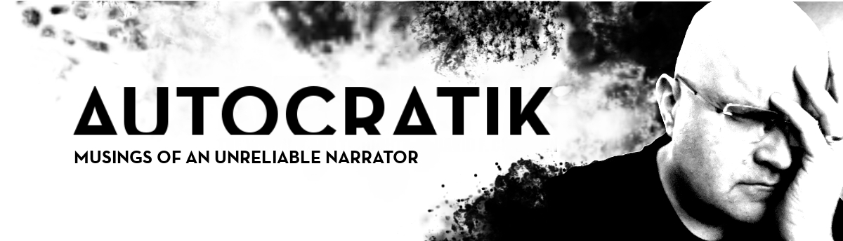
And, with #RPGaDAY ending a few days ago, I thought now would be a great time to rebrand a little. Nothing too major, just losing the Russian lettering and avoiding any confusion. So the new logo is the ultimate in minimal A's...
The typeface of the logo's different now as well. It used to be Impact, which is pretty common. And it's also cut off from the bottom - no it's not a cropping error... it's intentional. Makes the A's look like cool triangles. I like it. It's simple and basic...
Now I just need to do some new normal business cards and do a new T-shirt for Dragonmeet.
www.autocratik.com now directs to this blog, rather than the holder site. All the links from there are presented on the top here, and you can click those to directly follow me on Twitter, Facebook, Instagram and Youtube.
No comments:
Post a Comment